Tags
I wanted a super simple way to cross-link blog posts that require as little effort as possible, yet still looks good in vanilla markdown in GitHub. I have been using a snippet that puts HTML into the markdown. While this works, it's more manual/difficult for me does not look the best, and does not read well as
Goals for new card
The new card should be fully automated to expand with title, description, and cover image. Bonus if I am able to attach a comment behind it.
- fully automated
- card expansion
- Title
- description
- cover image
Old Card
If you can call it a card 🤣. This card was just an image wrapped in an anchor tag and a paragraph tag. I found this was the most consistent way to get an image narrower and centered in both GitHub and dev.to.
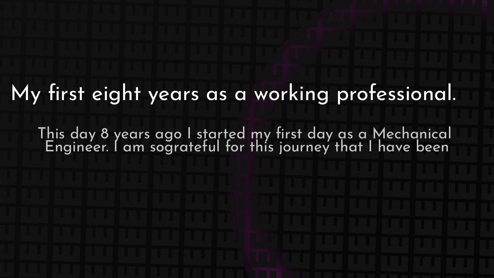
<p style='text-align: center'> <a href='https://waylonwalker.com/notes/eight-years-cat/'> <img style='width:500px; max-width:80%; margin: auto;' src="https://images.waylonwalker.com/eight-years-cat.png" alt="My first eight years as a working professional article" /> </a> </p>
The key here is that I have to put the HTML into the markdown. It looks a bit dirty while editing and quite frankly it's a pain to deal with.
New Card
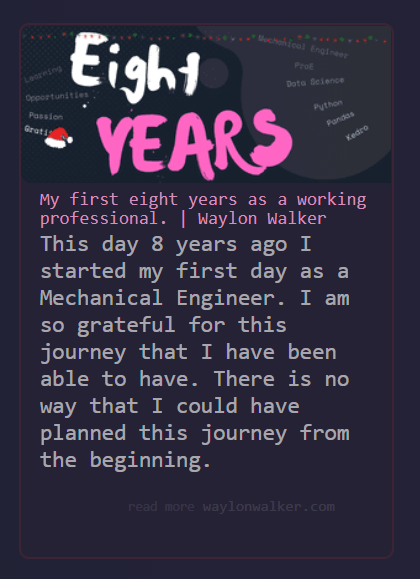
<a class="onelinelink" href="https://waylonwalker.com/eight-years-cat/"> <img style="float: right;" align='right' src="https://images.waylonwalker.com/29cdf6fcfb17d7fd766fc438144fb3e4/630fb/eight-years-cat-xmas2020.png" alt="article cover for My first eight years as a working professional."> <div class="right"> <h2>My first eight years as a working professional.</h2> <p class="description"> This day 8 years ago I started my first day as a Mechanical Engineer. I am so grateful for this journey that I have been able to have. There is no way that I could have planned this journey from the beginning. </p> <p class="url"> <span class="read-more">read more</span> waylonwalker.com </p> </div> </a>
First step
My first attempt was to make my own transformer for gatsby-remark-embedder. I previously set this up on my site for Twitter and YouTube. I tried to get some custom transformers going, to do what I wanted for my own website, but failed. I really struggled to understand what data was coming in and out of the transformer. My lack of js/node debugging skills was really showing.
using gatsby-remark-embedder to expand Twitter/YouTube
Redirects
It also works with redirects. I have a redirect to my "latest" post. It's something that I don't do the best job at keeping up to date, but when I feel really proud of a post I make it the latest.
this post is a redirect to my "latest post"
Client Side
I started out by running this card expansion client side. This was the strategy that I used to find the list of elements that should be transformed.
- get all anchors
- get all paragraphs
- filter paragraphs where the content is one of the links
- filter paragraphs where there is only one element in the paragraph
- filter to paragraphs with links that
shouldTransform - These elements should have the
oneLineLinkCardapplied.
const oneLineLinks = () => { const linkText = [...document.querySelectorAll('.post-body p a')].map( (p) => p.innerText ) const paragraphs = document.querySelectorAll('.post-body p') // const regex = /^https?:\/\/waylonwalker\.com\// const shouldTransform = (url) => regex.test(url) const anchorOnly = [...paragraphs].filter( (p) => linkText.includes(p.innerText) && p.childElementCount === 1 ) anchorOnly .filter((p) => shouldTransform(p.firstElementChild.href)) .map( async (p) => (p.outerHTML = await oneLineLinkCard(p.firstElementChild.href)) ) }
Styles
CSS is not my strong suit, but I can generally hammer something into a shape that I am happy with. For this one, I did struggle a bit with how it looked on various screens, particularly because I was holding the cover image size to a hard 300px. I ended up with more media queries than I needed, but it works.
.onelinelink + blockquote { position: relative; left: 2rem; background: rgba(0, 0, 0, .2); margin: -6rem auto 1rem; padding-top: 3rem; border: 1px solid goldenrod; border-top: 2px solid goldenrod; max-width: 300px; @media (max-width: 350px) { left: 0rem; margin-left: .4rem; margin-right: .4rem; } @media (min-width: 800px) { max-width: 600px; } @media (min-width: 900px) { max-width: 700px; } @media (min-width: 1000px) { max-width: 800px; } border-radius: 15px/45px; display: block; } } .onelinelink { position: relative; z-index: 2; margin: 4rem; overflow: hidden; display: flex; border: 2px solid rgba(255, 50, 50, .1); background: rgba(255, 50, 50, .015); background: #262236; text-decoration: none; border-radius: 8px; max-height: 126px; @media (max-width: 800px) { flex-direction: column; max-height: 800px; max-width: 300px; margin: 4rem auto; } h2 { top: -1.2rem; postition: relative; margin: 0; padding: 0; font-size: .8rem; font-weight: 400; } .right { width: 100%; padding: 5px 15px; } .description { font-size: 1rem; line-height: 1.2rem; height: calc(100% - 31px - 1rem); padding: 0; padding-bottom: 1rem; padding-top: .1rem; margin: 0; } .url { padding-right: 30px; color: rgba(255, 255, 255, .1); text-align: right; position: relative; z-index: 2; background: #262236; } img { max-width: 300px; max-height: 126px; padding: 0; margin: 0; border-radius: 8px 0 0 8px; } .read-more { font-size: .6rem; color: rgba(255, 255, 255, .08); } }
Final Look
On mobile, it renders vertically.

On desktop, it renders horizontally.

Expansion
I'm sure that all of this can be better, my js skills are still forming. It's quite humbling to see how hard it is to think in an unfamiliar language. The following oneLineLineCard renders a string template literal from a paragraph with a single anchor to a card that contains some of that pages meta information. The
getDescription` function uses a fetch to get the metadata right from the content of the page.
const getDescription = (url) => fetch(url) .then((r) => r.text()) .then((html) => { let parser = new DOMParser() let doc = parser.parseFromString(html, 'text/html') let meta = doc.querySelectorAll('meta') const description = [...meta].filter( (m) => m.name === 'og:description' )[0].content const image = [...meta].filter((m) => m.name === 'og:image')[0]?.content const sm_image = [...meta].filter((m) => m.name === 'og:sm_image')[0] ?.content const url = [...meta].filter((m) => m.name === 'og:url')[0]?.content const title = [...meta].filter((m) => m.name === 'title')[0]?.content return { description, image, url, title, sm_image } }) const oneLineLinkCard = (url) => { return getDescription(url).then( (meta) => `<a class="onelinelink" href=${meta.url}> <img src='${meta.sm_image ? meta.sm_image : meta.image ? meta.image : ''}' alt='cover image for ${meta.title ? meta.title : ''}> <div class="right"> <h2>${meta.title ? meta.title : ''}</h2> <p class='description'> ${meta.description ? meta.description : ''} </p> <p class="url"> <span class='read-more'>read more</span> waylonwalker.com </p> </div> </a> ` ) }
It works
And it works. Whenever I reference my own blog with just a single link on a line in markdown I get a nice card link out to the other post, with a small image sized for the card, the title, and the description of the post.
But
- too much client-side
- does not work well with cross-posting
For every link I do this with the client will pull the full page just to get a bit of metadata. I am already doing a bit more than I want to do client-side for a blog, so I would prefer to do it ahead of time.
Additionally, since it is done client-side it does not translate well when I copy my markdown to various other blogging platforms. If it were rendered right into the markdown cross-posting would be much easier.
Future State
actually already implemented at this point
The direction I am going to try is to use python to load each post, look for lines that contain only a link, then render this same markup right in the markdown. For this I am going to use a language I am more familiar with, python, and do this inside of GitHub actions just before build time so that the markdown I write stays the same, the cards will only be rendered in prod.
Why Python 🐍
Python is my every day what I know, I work much more efficiently and cleanly with it. Also the more I blog the more abstractions I am seeing and the lazier I am getting. Things like description, SEO, cover images are all getting automated. Gatsby really doesn't like to run when some of those things are missing, probably due to my lack of JS error handling skills. I find it much easier to load up all the pages and patch up the frontmatter in python before build time.
I am kinda curious if eventually, I can re-create everything I need in python because I am honestly not using react for much more than a glorified templating system, besides search. If I can pre-render everything in python
What do you think??
Do they look good? Could they be better?

