
Tags
Flexbox-zombies #
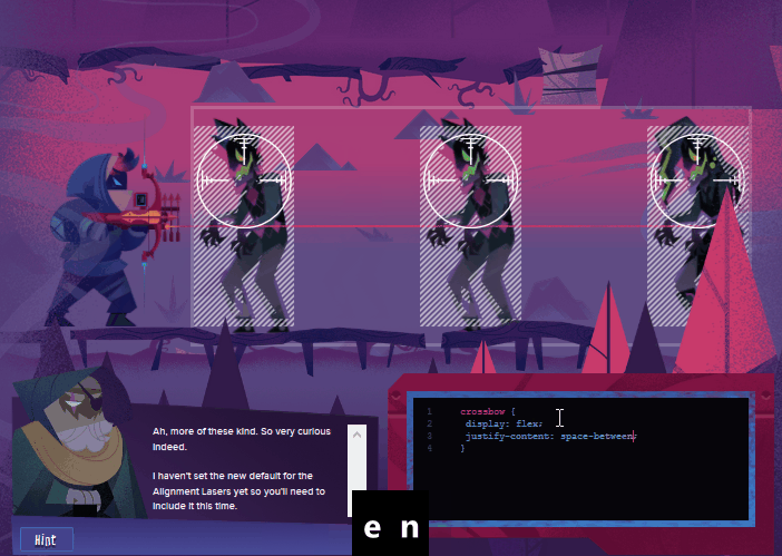
I recently finished up the flexbox-zombies course to learn more about flexbox, and to become proficient with it. I can truly say that this course has changed the way that I create layouts. Flexbox is very intuitive now. What this course does really well at is explaining the concepts and hitting you with a ton of examples that you can work through really quickly.
A clip from the final round against Dave
Basic Setup #
Flexbox requires a wrapper container to work I will refer to this as the flex container, and the items in that container as items.
Markup
I will use the following markup throughout the article, each with different css applied.
note The animated container is inspired by the flexbox-zombies course. I really like how it allows you to see the responsiveness of each layout. In the early example the reasoning may not be aparent, but as we go along some of the flexbox parameters will make more sense if we are viewing them on a dynamic layout since flexbox is designed for building responsive design.
<div class='flex_container'> <div class='item'>1</div> <div class='item'>2</div> <div class='item'>3</div> <div class='item'>4</div> </div>
Base Style
.item { color: #6394C8; font-size: 1.5rem; padding: 1rem; display: flex; justify-content: center; align-items: center; height: 100px; width: 100px; background: #351D57; margin: 5px; border: 2px solid #A83E75; box-shadow: 5px 5px 10px -5px rgba(0, 0, 0, .6); } .flex_container { padding: 1rem; box-shadow: 5px 5px 10px -5px rgba(0, 0, 0, .6); background: rgba(99, 148, 200, .2); animation: animate_container 2s cubic-bezier(.66, -0.0, .28, 1.0) infinite both alternate; } /* Animate the .flex_container to show responsiveness */ .flex_container:hover { /* But not on hover, let the user pause the annimation*/ animation: none } @keyframes animate_container { 0%{ width: 95%; } 20% { width: 95%; } 80% { width: 200px; } 100% { width: 200px; } }
Basic Technique #
1. Turn on the crossbow
applied to the flex container
display: flex;
Turning on flexbox on the flex container will cause all child elements to align in a row at the top left corner of the parent container. By defualt they will shrink to the minimum content size, but not automatically grow larger than their specified size.
.flex_container { display: flex; }
2. Aim it if necessary
applied to the flex container
This parameter determines the direction that the flexbox container will orient the flex items.
example flex-direction: row
options = ('row'(default), 'column', 'row-reverse', 'column-reverse')
row
.flex_container { display: flex; flex-direction: row; }
column
.flex_container { display: flex; flex-direction: column; }
row-reverse
.flex_container { display: flex; flex-direction: row-reverse; }
column-reverse
.flex_container { display: flex; flex-direction: column-rerverse; }
3. Line them up along the red Justify Laser
applied to the flex container
This parameter determines justification of the flex items within the flex container. Think spacing or positioning around the flex items.
example justify-content: flex-end;
options = ('flex-start', 'flex-end', 'space-between', 'space-around', 'space-evenly', 'stretch', 'center', 'start', 'end', 'left', 'right')
flex-start
.flex_container { display: flex; justify-content: flex-start; }
flex-end
.flex_container { display: flex; justify-content: flex-end; }
space-between
.flex_container { display: flex; justify-content:space-between; }
space-around
.flex_container { display: flex; justify-content: space-around; }
space-evenly
.flex_container { display: flex; justify-content: space-evenly; }
center
.flex_container { display: flex; justify-content: center; }
3b. Align them along the blue Alignment Laser
applied to the flex container
align-items: flex-end;- options = ('flex-start', 'flex-end', 'normal', 'end', 'self-start', 'self-end', 'center', 'start' 'end')
flex-start
.flex_container { display: flex; justify-content: flex-start; }
flex-end
.flex_container { display: flex; justify-content: flex-end; }
center
.flex_container { display: flex; justify-content: center; }
4. Take care of any one-off alignments
applied to items
align-self: flex-start;- options = ('flex-start', 'flex-end', 'normal', 'end', 'self-start', 'self-end', 'center', 'start' 'end')
combine
the align-self property is used to take care of one off alignments and is applied to the item itself. All of the parameters are the same as align-items. In this example we will apply all of the previous example alignment types into one.
.flex_container { display: flex; } .item:nth-of-type(1){ align-self: flex-start } .item:nth-of-type(2){ align-self: center } .item:nth-of-type(3){ height: auto; align-self: stretch; } .item:nth-of-type(4){ height: auto; align-self: flex-end; }
6. growth along the red Justify Laser
applied to items
flex-grow: 1
flex-grow
By setting flex-grow: 1; on item 3 it will take up any available free space.
.flex_container { display: flex; } .item:nth-of-type(3) { flex-grow: 1 }
multiple flex-grow
By setting flex-grow: 2; on item 1 will take up the available free space 2x faster than 3
.flex_container { display: flex; justify-content: flex-start; } .item:nth-of-type(3) { flex-grow: 1 } .item:nth-of-type(1) { flex-grow: 2 }
7. setting length of items along the red Justify Laser
applied to items in order of importance
min-widthmax-widthflex-basiswidth
8. Out of Order
applied to items behaves similar to z-index
order- takes an integer value
order 1
.flex_container { display: flex; } .item:nth-of-type(3) { order: 1 }
order -1
.flex_container { display: flex; } .item:nth-of-type(3) { order: -1 }
9. Get your own Line
applied to the flex container
flex-wrap- options=(wrap, nowrap(default))- prefers wrap over shrink
- but will still shrink after fully wraped
wrap
.flex_container { display: flex; flex-wrap: wrap; }
10. Aligning wrapped content
applied to the flex container
align-content- same specs as align-items but works on wrapped content.
wrap
.flex_container { display: flex; height: 700px; flex-wrap: wrap; align-content: center; }
11. Shortcuts
flex applied to the flex items
flex: grow, shrink, basis- defaults -
flex: 1 1 0px - setting
flex: noneis equivalent toflex: 0 0 auto
flex-flow applied to the flex container
flex: flex-direction flex-wrap
Chapter 7: In a Perfect World (flex-basis)
flex-basis
- Starting point, ideal size, hypothetical size
- applied to items
- overrides width
- shinks if necessary
When Shooting Horizontally it controls width
When Shooting Vertically it controls height