Tags
I recently gave a talk at python web conf 2022, and one of the things I did when I should have been working on my presentation was workig on how my presentation looked... classic procrastination technique.
Slide One #
Lets use this section to show what it looks like as I change my styles.
from markata import Markata Markata() markata.run()
☝ This is how my website is built
- write markdown
- build site
- publish
default #
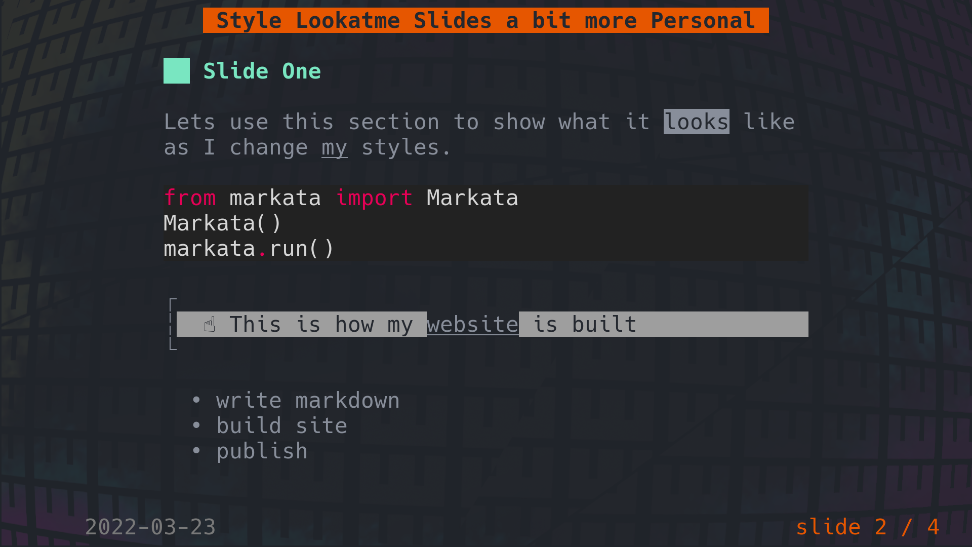
This is what the above slide looks like in lookatme.
Set focus to the most important element #
The way I write my slides I want the most prominant element to be the slides title, not the presentation title. The slides title is generally the point I am trying to make, I will leave some supporting information if I want, but sometimes, I just have a title.
styles: title: bg: default fg: '#e1af66' headings: '1': bg: default fg: '#ff66c4,bold,italics' prefix: ' ⇁ ' suffix: ' ↽ '
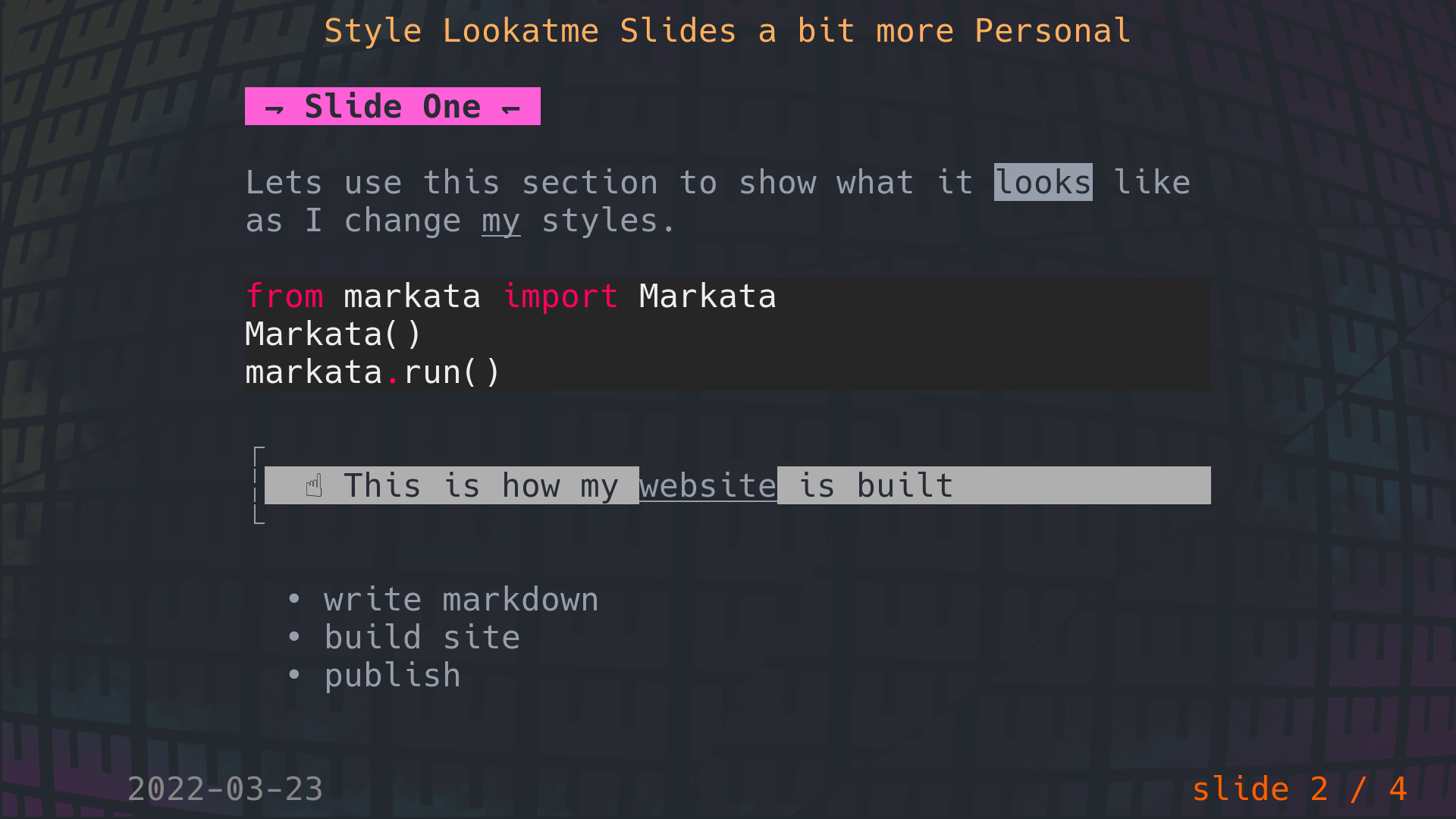
by default he prefix/suffix was a full block that just went transparant into the slide. I thought the harpoons were fun and went with them on a whim
The box characters bother me #
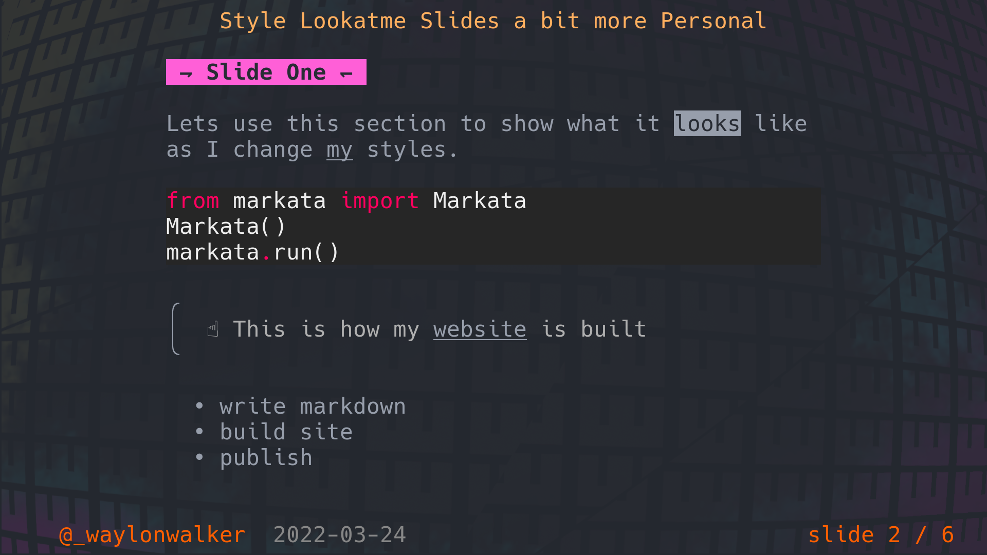
The box characters are fine really, but it really bothers me that they are not conneted. The author is probably doing this because it looks ok on most systems, and many terminals dont have their fonts right and wont align anyways. I am not sure if I ever had a windows terminal other than their new Terminal that properly connected box characters.
quote: side: '│' style: bg: default fg: '#aaa' top_corner: '╭' bottom_corner: '╰'
Add Author #
Adding author to the root of the frontmatter of the document will add it to the bottom left of the slides.
author: '@_waylonwalker'
Style the author #
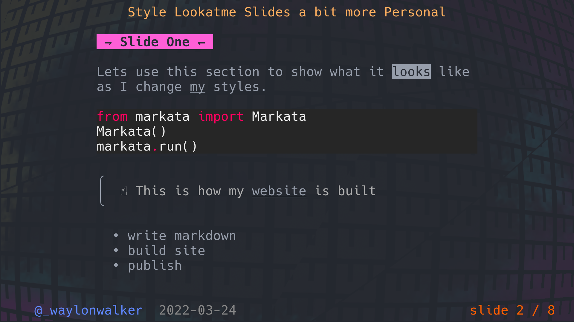
We can style the foreground and background of this text by adding something like this to the styles section of the frontmatter.
author: bg: default fg: '#368ce2'
The rest of the footer #
While we are at it, lets style the rest of the footer to my own theme. Let's pop this into the style and see what it looks like.
date: bg: default fg: '#368ce2' slides: bg: default fg: '#368ce2'
reduce the padding #
When I am presenting I am punched in as big as I can go, and which makes the padding massive. I want as much as the screen real estate devoted to making big readable text as I can.
padding: bottom: 0 left: 0 right: 0 top: 0
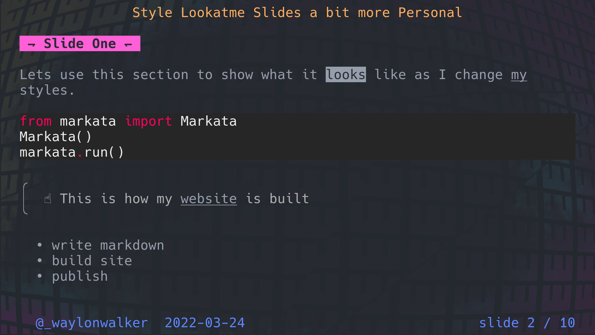
final results #
Here is what the final frontmatter looks like to fully style my talk.
--- date: 2022-03-24 templateKey: til title: Style Lookatme Slides a bit more Personal tags: - python - cli - python author: '@_waylonwalker' styles: padding: bottom: 0 left: 0 right: 0 top: 0 title: bg: default fg: '#e1af66' date: bg: default fg: '#368ce2' slides: bg: default fg: '#368ce2' headings: '1': bg: default fg: '#ff66c4,bold,italics' prefix: ' ⇁ ' suffix: ' ↽ ' quote: side: '│' style: bg: default fg: '#aaa' top_corner: '╭' bottom_corner: '╰' author: bg: default fg: '#368ce2' ---
