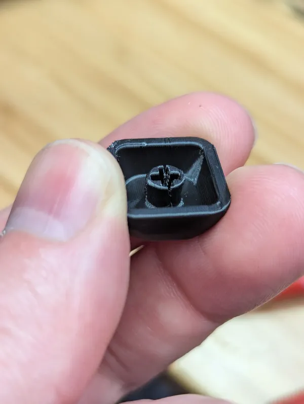
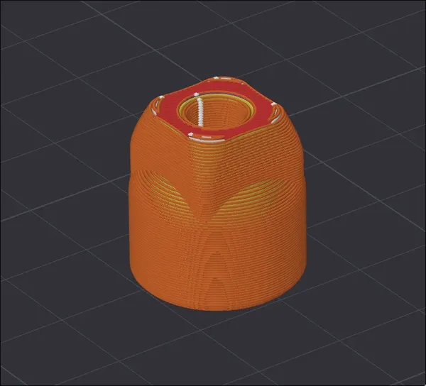
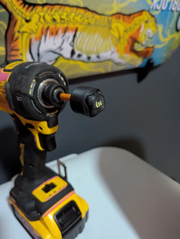
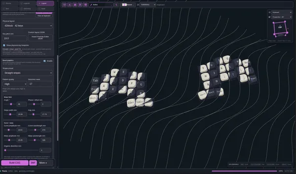
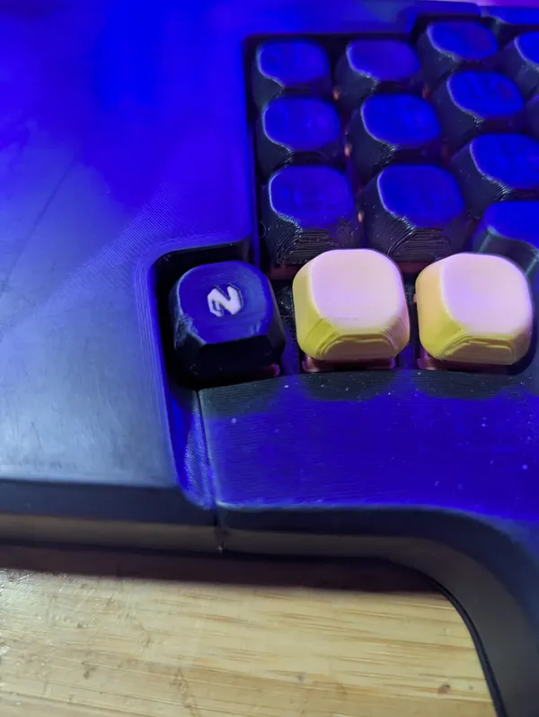
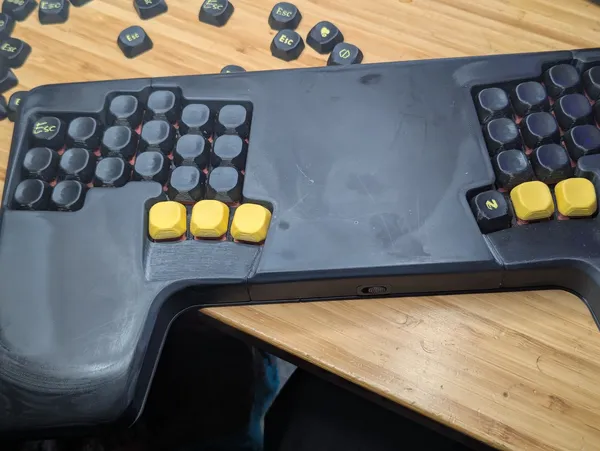
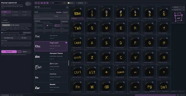
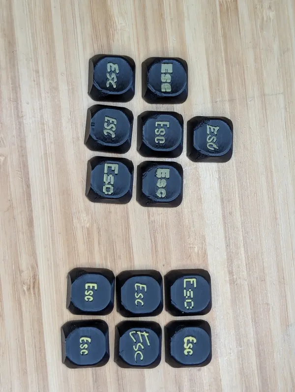
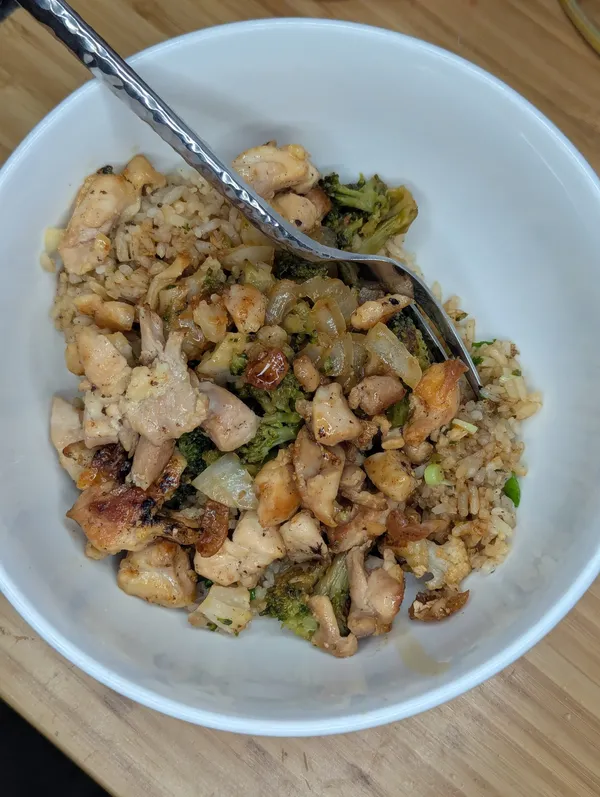
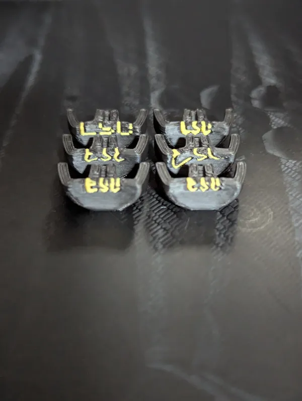
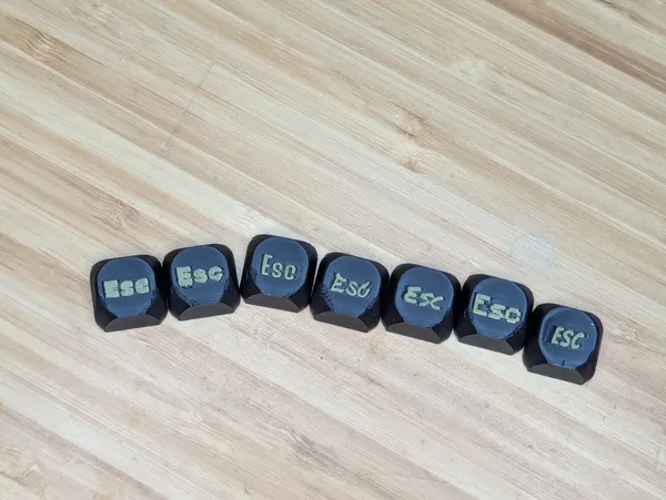
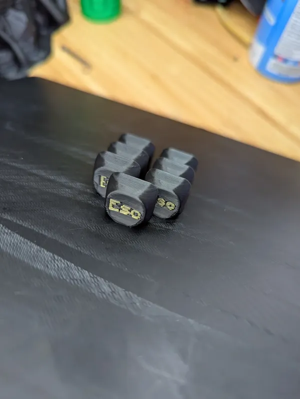
I learned that my caps were set to interface fit and most crack on install. Making the + pattern bigger makes them easier to get on and actually hold tighter.Any Guesses What I'm Printingcap sander v1Demo of different fonts in caps.caps gets striped keysDemo of different view modes in caps.dark foggy tunnelHere's a recording adding different symbols to caps.New workflow unlocked, sharing images and links straight to plaindown on my phone.custom 3d printed neovim logo keycapC'mon, Toyota, where's your Nerd Font?Here's a recording running through caps themes and filament colors, caps is a cap creation site I'm working on.Installed a new nvim capcaps review with individual key overrideRunning some test prints on keycaps using some different fonts, the group on the left (top) was done first with 0.4 mm depth and the right (bottom) was done with a 2 mm depth, the colors came out much more vibrant without the black blending in.A banger home flat top cook of chicken fried rice.The legends were cut quite a bit deeper in this set I think the color is going to come out much more vibrantThis first set of caps printed for real off my new https://caps.waylonwalker.com app came out really well, I can tell the legend cut is not deep enough and the two colors are mixing too much. I'm actually surprised at how much I like the thinner sets better than the thicker sets, I thought thicker would have done better prints.No raft straight on the bed with a 0.4 mm sink into the plate stuck really well, none fell off mid-print. I've struggled to get grids of caps to print well in the past.First iteration of the caps app is working, I cannot believe it.